Overview
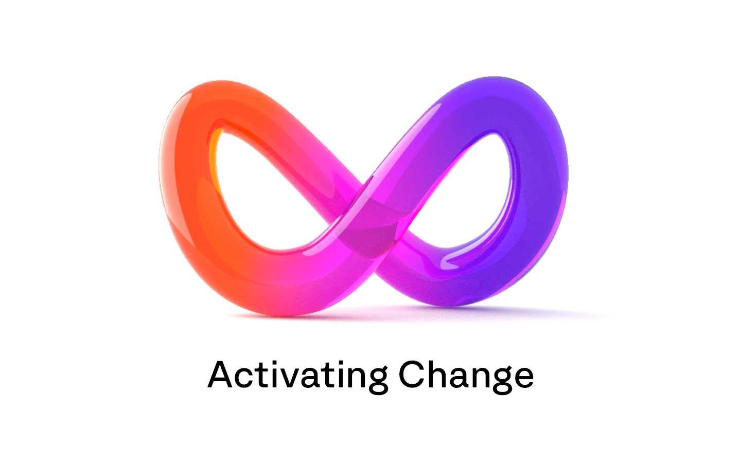
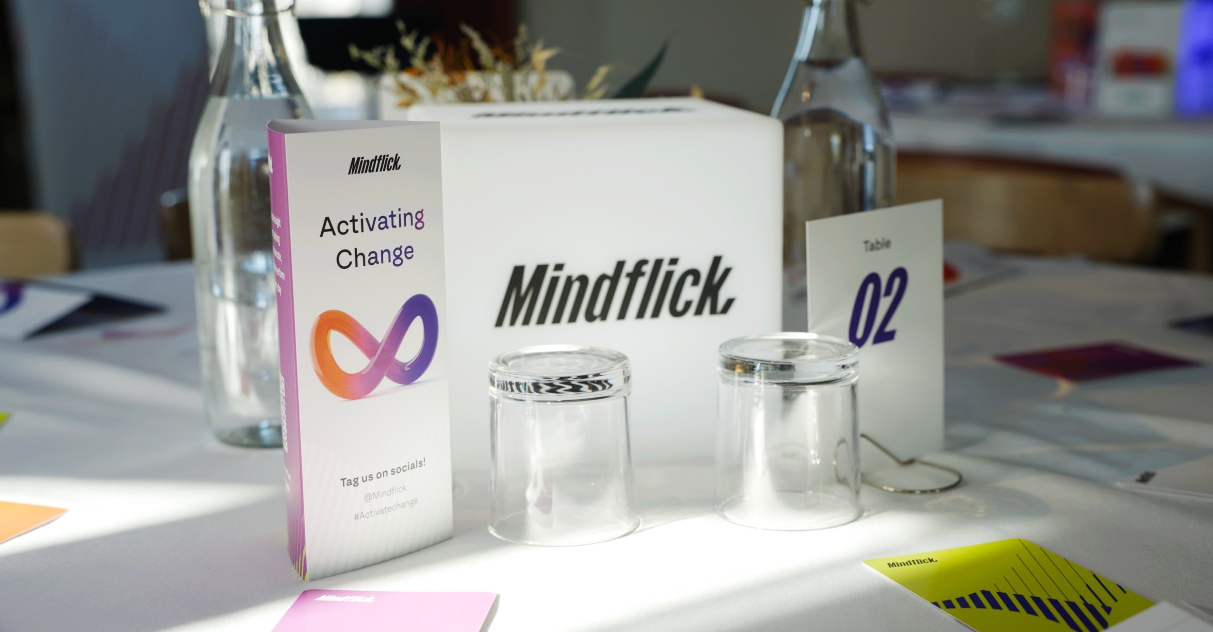
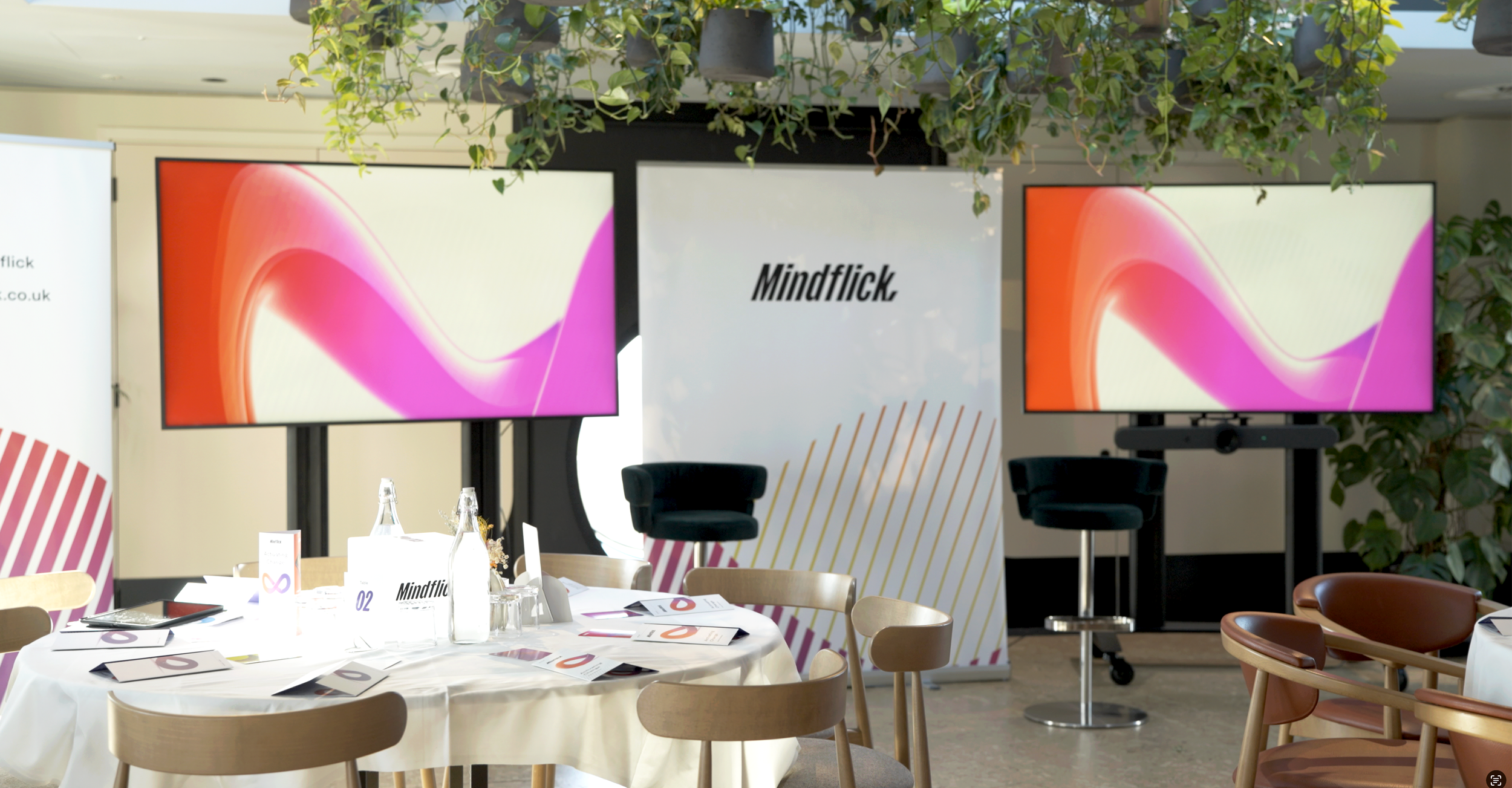
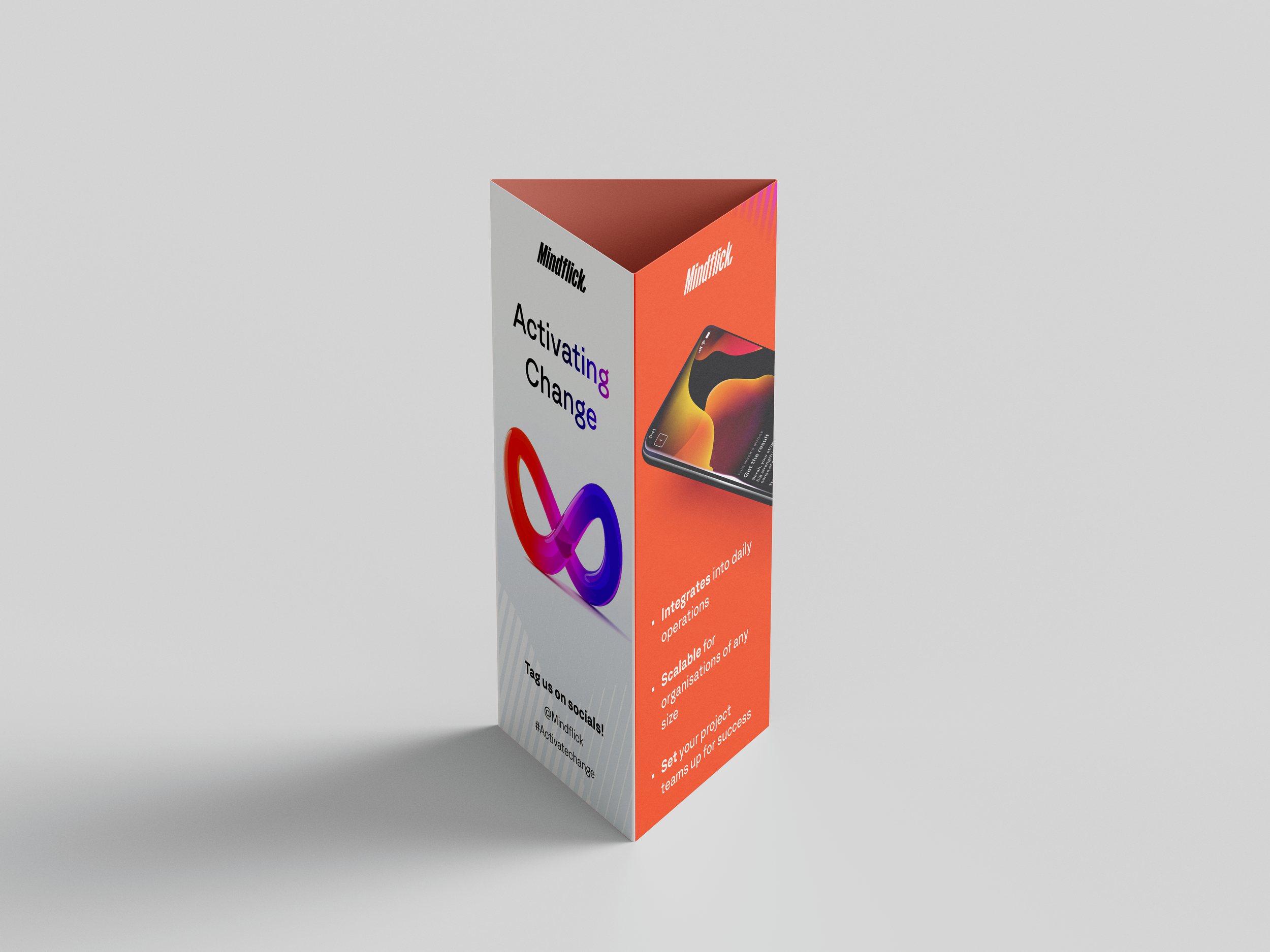
Activating Change
Mindflick works at the intersection of psychology and performance. When they launched a quarterly event series exploring the human science of delivering large projects, they needed an identity that could carry that weight; emotionally resonant, visually distinct, and consistent with a brand’s refresh.
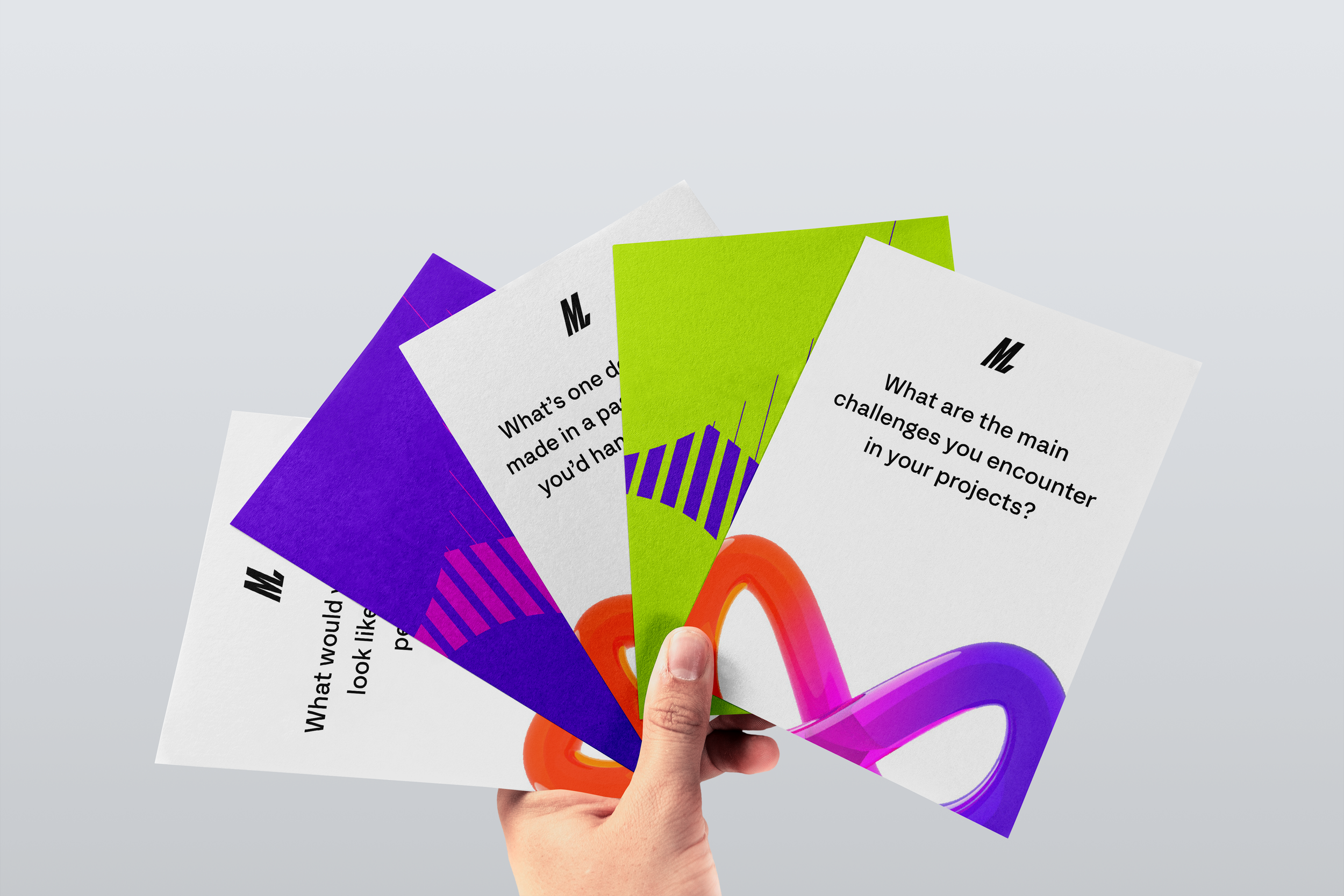
The brief pushed us to ask: how do we visualise the unseen mindsets that shape performance?
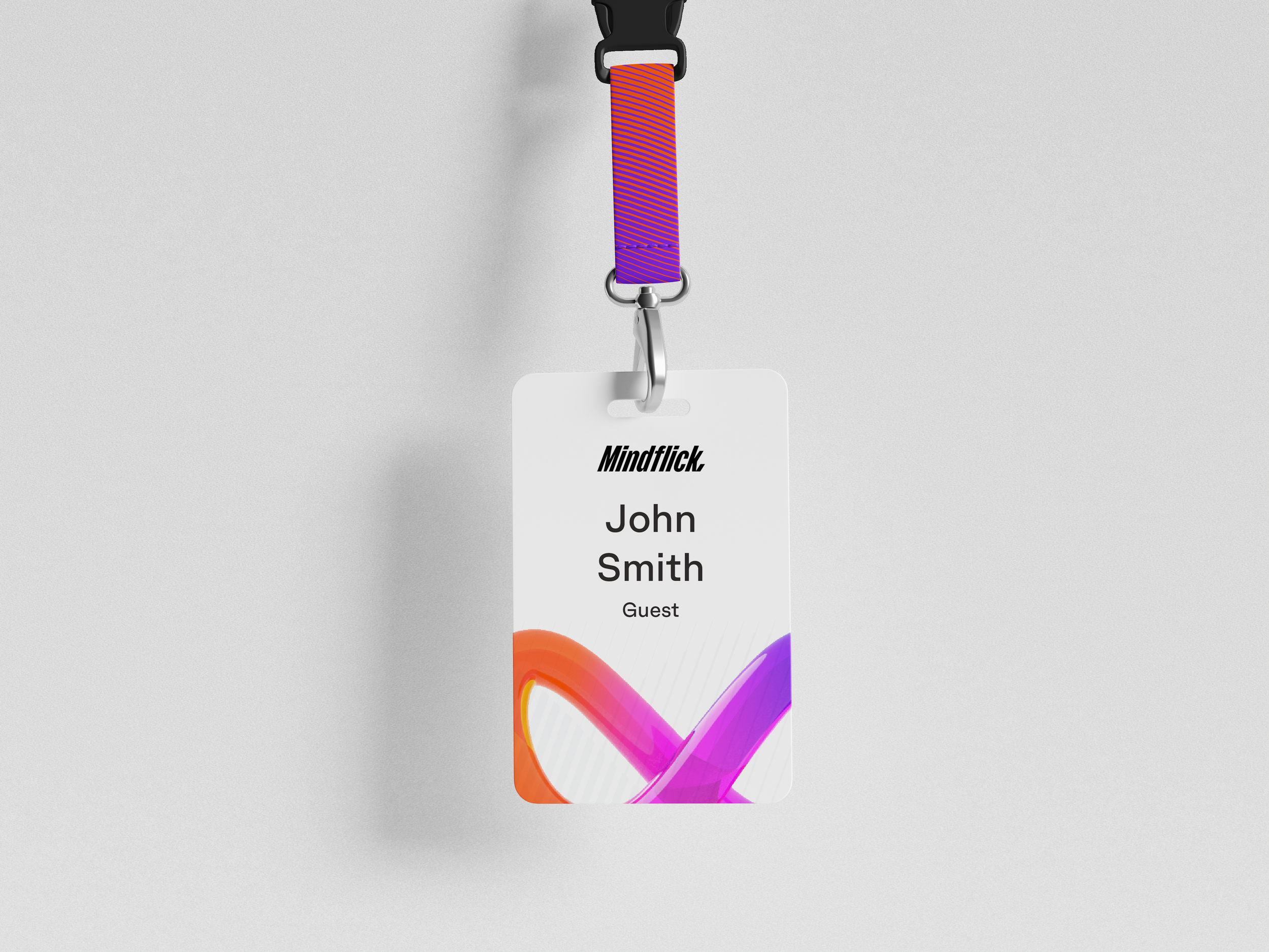
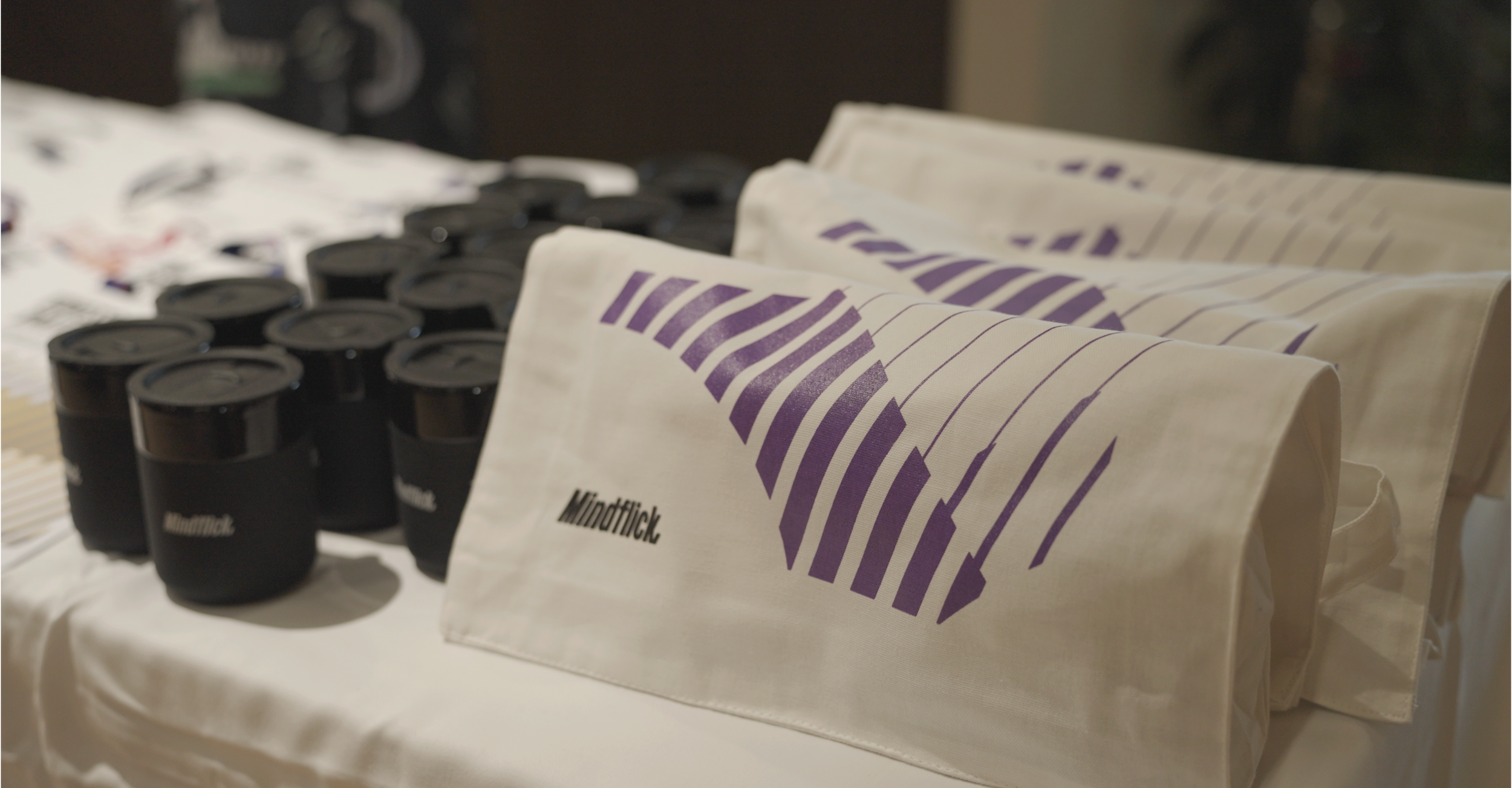
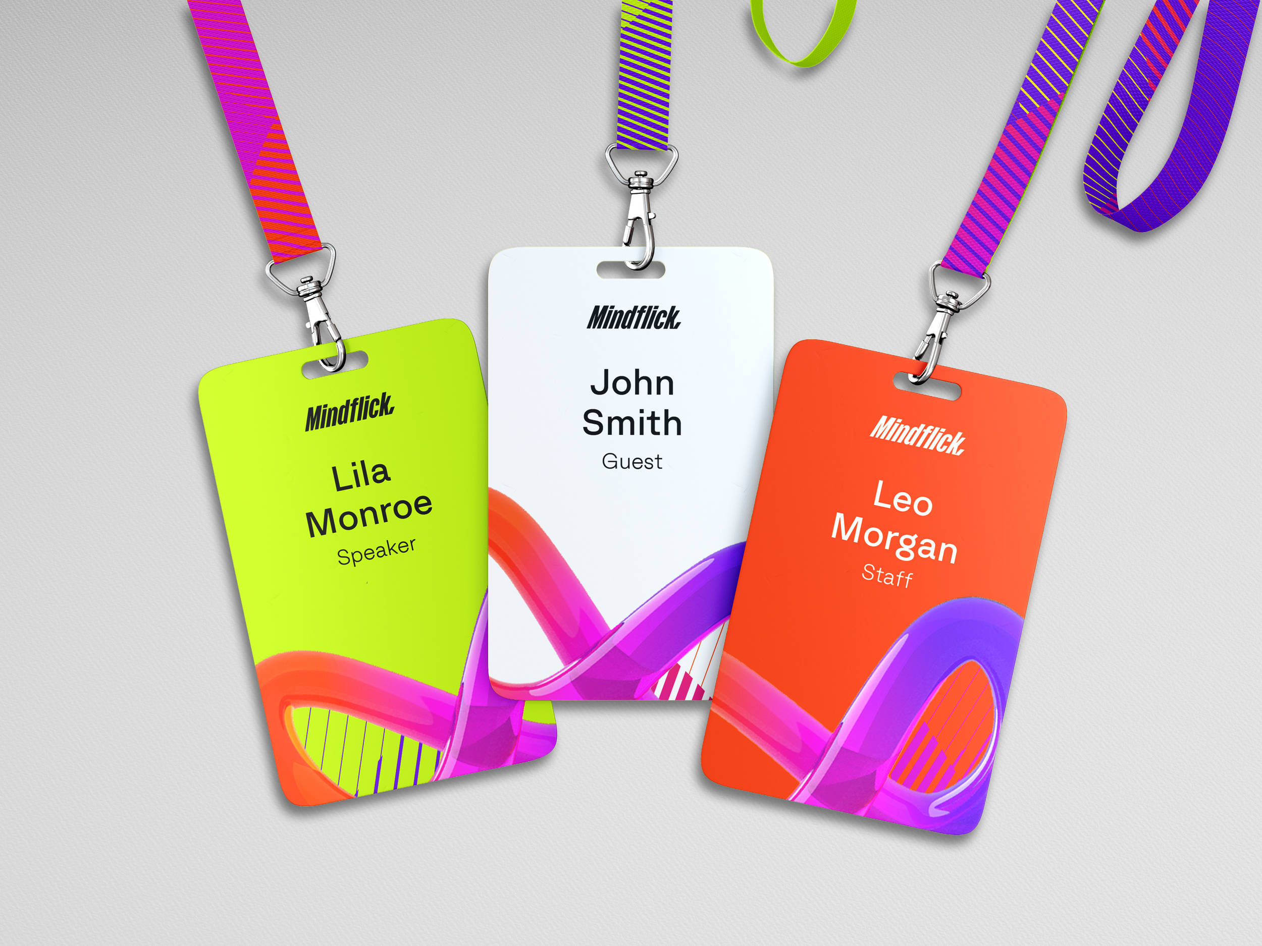
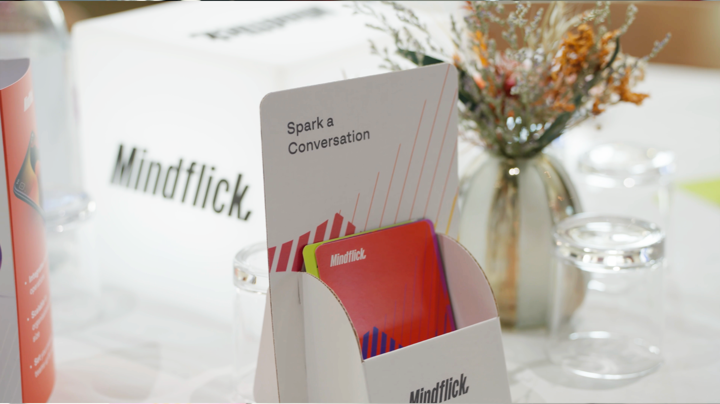
Workshops with the growth team uncovered the answer. The feeling delegates needed to leave with was hope. That single word drove every decision; a gradient colour system, a continuous 3D infinity loop symbol rendered in Blender (born from a psychologist's opposing mindset diagram), a warm and energetic tone across every touchpoint. Existing brand assets like waves and sparks were layered in to keep it grounded in Mindflick's world while introducing something genuinely new.
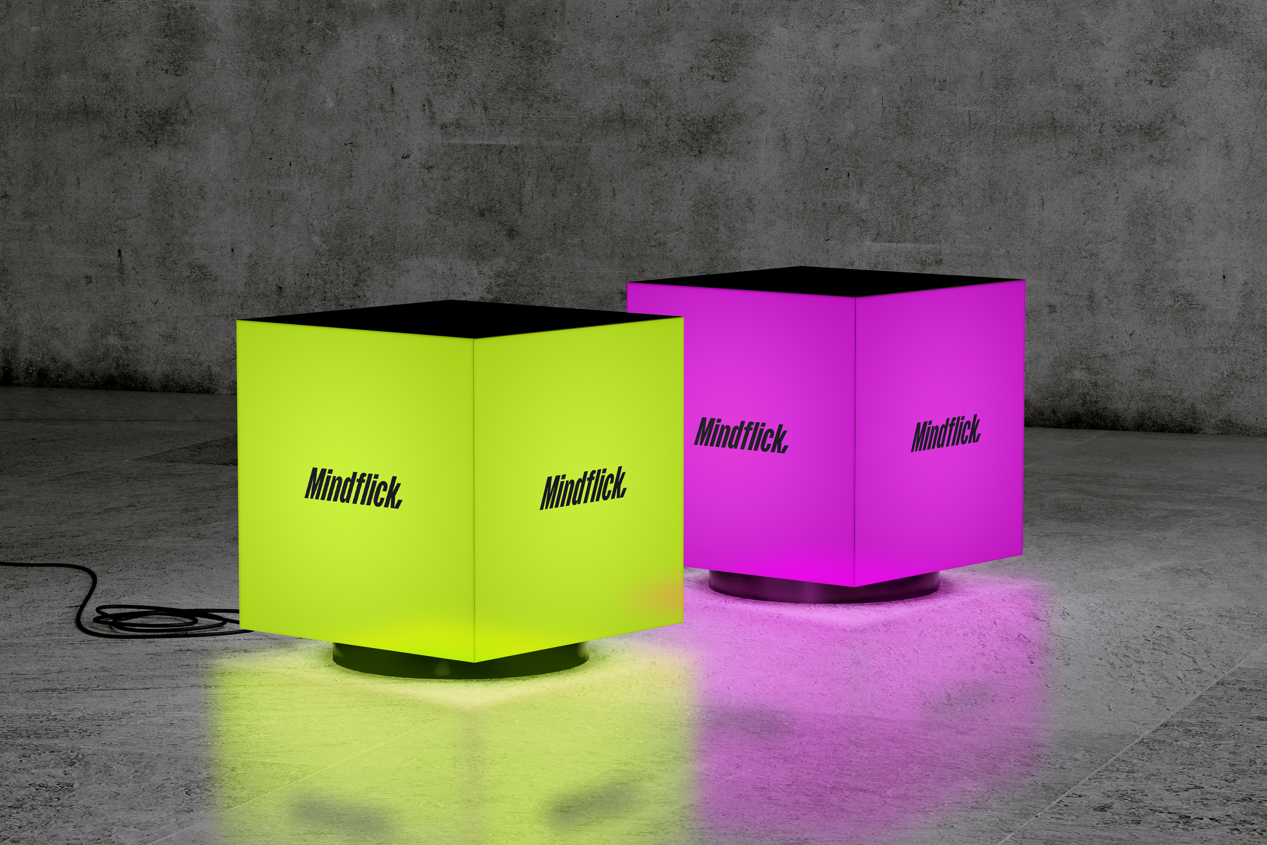
Where competitors lean on polished but predictable event branding, this identity had meaning baked in. Every material was designed for reuse, prioritising LED and digital over single-use print, because the brand's values demanded it.
The event sold out. Over 50 C-suite executives attended. The email sequence hit 80%+ pre-event completion.
Campaign design | Creative and design lead | Visual Identity | Campaign Planning
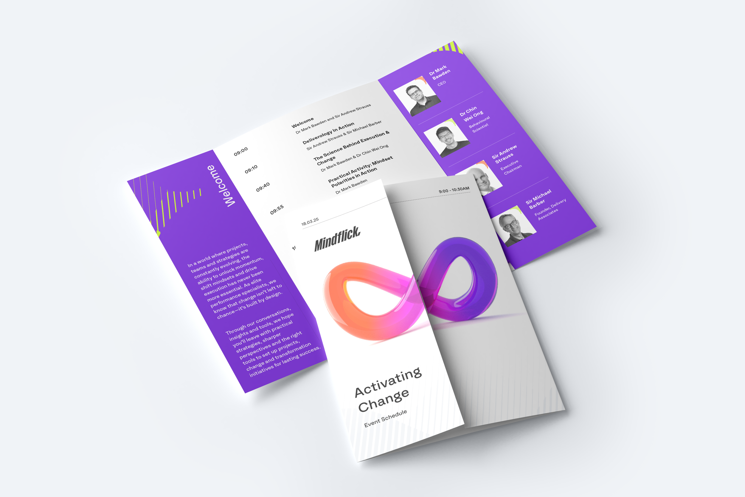
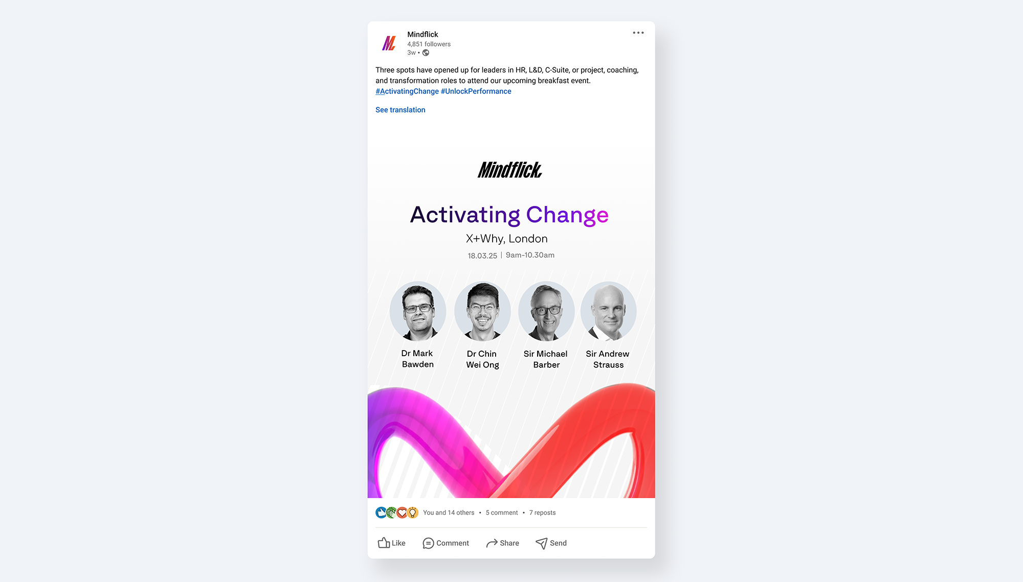

The event sold out, with over 50 C-suite executives and senior leaders in attendance including Sir Andrew Strauss, Sir Michael Barber and Dr Chin Wei Ong.
The email sequence achieved 80%+ pre-event delegate questionnaire completion, with only a small number completing on the day.
Following the event, the CEO said the campaign felt truly like Mindflick, the clearest signal that the creative direction had successfully captured the brand's identity at a pivotal moment of transition.